Beige Is a Backdrop, Not a Verdict: Color Planning for Rented Rooms
Landlord white gets blamed for a lot. It's called boring, cold, unfinished, and worse — usually by people who just signed a lease and are now staring at four walls they aren't allowed to touch. But most of the beige, greige, and builder-white out there isn't actually bad. It's just unanswered. A wall color only looks accidental when nothing in the room seems to know it's there.
The fix isn't a bold paint job you'd have to undo in eleven months. It's a palette built around a fixed variable. Think of it as decorating with the lease instead of against it — the wall stays, everything else does the talking.
Name the white before you buy a single thing
"White" is a rumor. Your walls might be warm beige with a yellow undertone, a cool gray that reads blue in the afternoon, or the flat chalky white common to new-build apartments. Each one wants a different cast of supporting characters.
Here's the two-minute test: hold a sheet of plain printer paper against the wall around 10 a.m., then again at 7 p.m. under your lamps. If the paper looks bright blue-white, your wall leans warm. If the paper looks dingy or gray next to it, your wall leans cool. Take a phone photo of both, because memory lies.
While you're at it, look down. Your flooring is the second-biggest fixed surface in the room, and a warm oak floor under cool gray paint changes the whole conversation. Warm floors plus cool walls is a great setup — it's the palette equivalent of a good handshake.
The one-degree rule
Most renter color schemes fail by a single degree. Someone puts a soft gray-green sofa in a yellow-beige room and suddenly everything reads a little dirty. Or a cool lilac throw gets dropped onto a warm cream wall and the wall looks like old paper.
You have two moves, and both are clean:
- Agree with the undertone. Warm walls get cream, camel, rust, olive, walnut, and brass. Cool walls get ink, charcoal, icy blue, plum, and brushed nickel. When in doubt, match the temperature, not the color.
- Commit to contrast. Instead of a slightly different neutral, go far enough away that it's clearly a choice — deep navy, forest green, burnt orange. Nobody thinks a room is accidental when one object is loudly intentional.
What you want to avoid is the middle ground: colors that are almost your wall color but not quite.
Room-by-room palettes that work on rental walls
Living room on warm beige
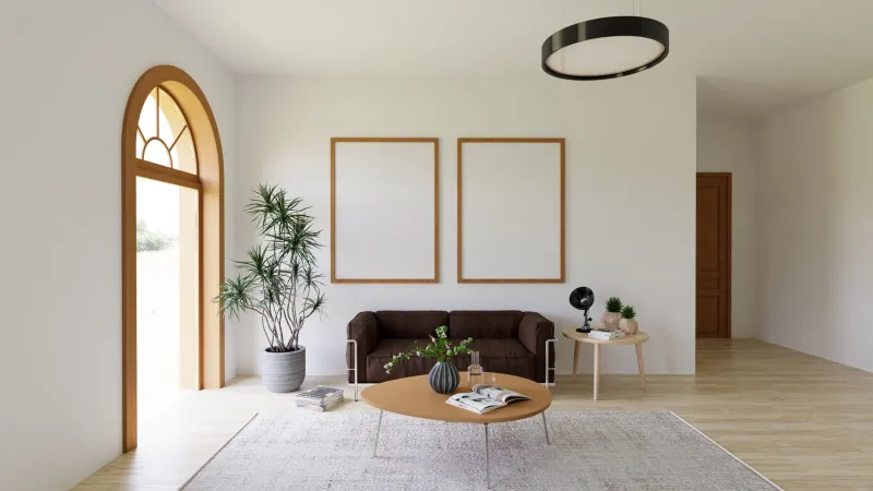
Beige is a chameleon, and it loves earth tones. Anchor with a walnut or honey-oak piece, layer an olive or terracotta rug, and let cream (not stark white) handle the bright surfaces. Add one warm metal — brass or aged bronze — and the whole room reads as deliberately golden rather than vaguely tan.
Bedroom on cool gray
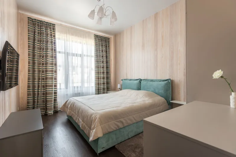
This is the easiest wall color in the rental universe. Lean into it: oatmeal bedding, dusty rose or muted lavender textiles, one piece of black furniture, and a deep ink-blue curtain panel that runs floor to ceiling. A tension rod accomplishes the install; the extra fabric length makes the ceiling look higher than it is.
Kitchen and dining on builder white
Flat white walls in a rental kitchen look unfinished because there's usually no color anywhere else. Don't fix the wall — fix the room around it. A washable patterned runner, green or amber glass canisters, a stack of colorful cookbooks, and a wood-toned table will do more than paint ever could. Pick two colors and repeat each one three times.
Bathroom, usually the whitest room
Bathrooms are where renters get permission. A patterned shower curtain, a saturated bath mat, and a small piece of framed art above the towel bar are all removable and all do heavy lifting. Choose whatever color you'd never paint a whole room — it's contained here.
The 60/30/10 math, renter edition
Sixty percent of what you see should be a neutral — and yes, your walls count toward it, which is basically free. Thirty percent goes to your secondary color: the rug, the sofa, the curtains, the bedspread. Ten percent is the accent you actually fell in love with: a lamp, a throw, a set of frames, a vase.
Most renters invert this. They buy a bunch of accent pieces, scatter them, and blame the beige.
Low-commitment accents that leave no trace
Textiles carry the most weight for the least risk. Curtains, rugs, throw pillows, and bedding are all colors you can take with you. Beyond fabric, consider:
- Art with generously wide white mats, which gives busy walls breathing room
- Lampshades and switch plates swapped back at move-out
- Books organized by spine color on open shelving, which reads as a built-in accent wall
- Removable peel-and-stick tile as a backsplash or renter-friendly wallpaper panels for the one wall that needs a statement
- Hardware you swap and store in a labeled bag inside your toolbox
Move-out checks, or how to make the palette travel
Before you commit to a color story, run these three tests.
Buy for your furniture, not for the wall. If your sofa, rug, and bedding already work together without the wall in the picture, the scheme will survive your next apartment — even if the next one is a completely different white.
Keep a swatch box. Toss fabric snips, paint chips, and a photo of each finished room into a shoebox. When you move, you already know what your things look like in daylight, and you won't re-buy a rug that fights your new floor.
Photograph every room in daylight before you hang anything. Twice now you'll notice something a mirror was hiding, and you'll have proof of the condition of the walls for your move-in file.
One last note: check your lease before anything adhesive goes up. Most standard agreements allow small nail holes and normal patching, but a few are strict about adhesive residue on painted surfaces. A two-minute email to your property manager beats a deduction in eleven months.
Your wall color was never the problem — it was just waiting for something to answer it. Build the answer, and the beige starts looking like a decision you made on purpose.